
Ghost Bomb
COLORADO, DELAWARE, MARYLAND & NEW YORK (+ guest appearances by INDIANA, LOUISIANA, MICHIGAN & NEW JERSEY ) - All Cause Mortality Data in the Context of the Covid Timeline

I’m a former public employee that did not want to put an experimental drug into my body just to keep my job. That experience has probably scarred me for life. I am now looking at public institutions, state by state, to see if there is any potential (official) evidence of harm caused by those coerced covid vaccinations.
.
Since it has occurred to me that it is really, really nice to have official monthly data in order to compare events to the timeline of Covid, I am going to keep giving you that from state to state as I find it … a continuation of what I started here.

In my last installment “No Two for You”, I mainly was exploring the disappearance of spike number two (August of 2021/Pfizer full approval) in a trio of “blue” states. The three spike pattern has been described by Debbie Lerman in her recent work.
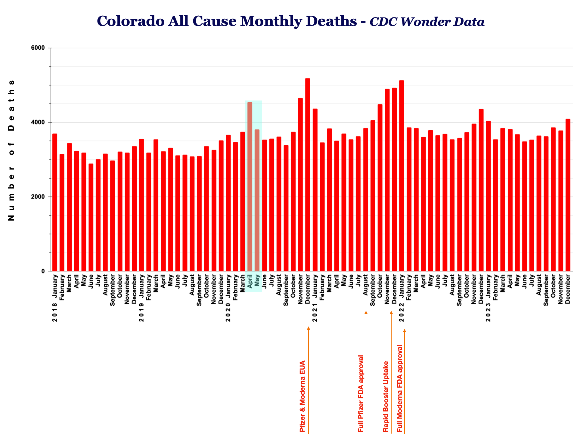
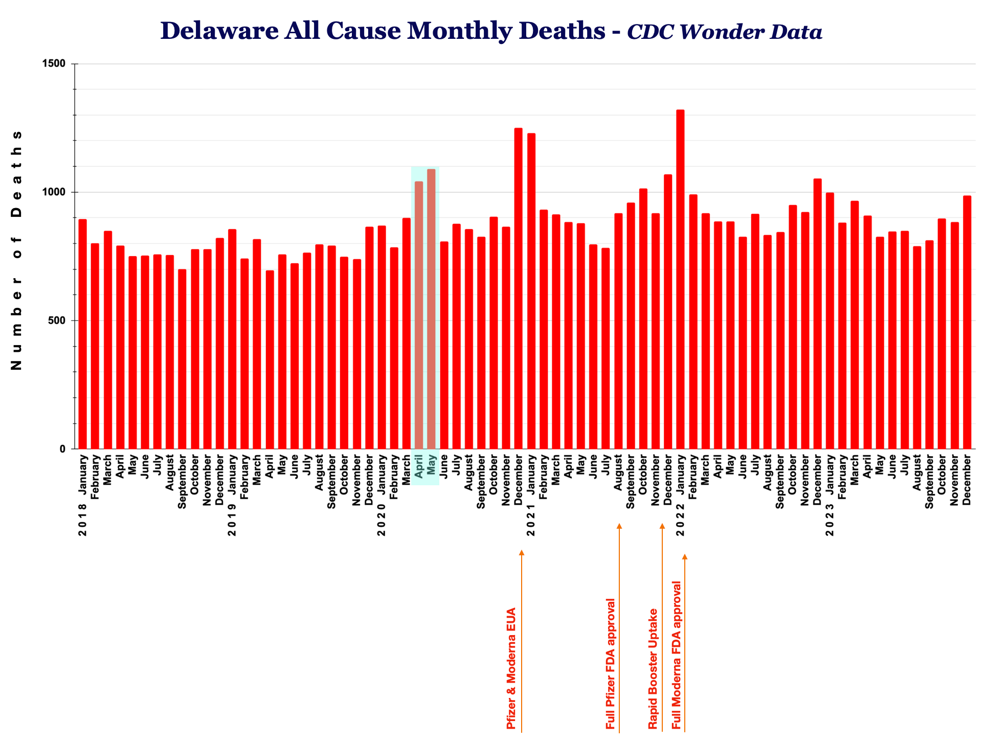
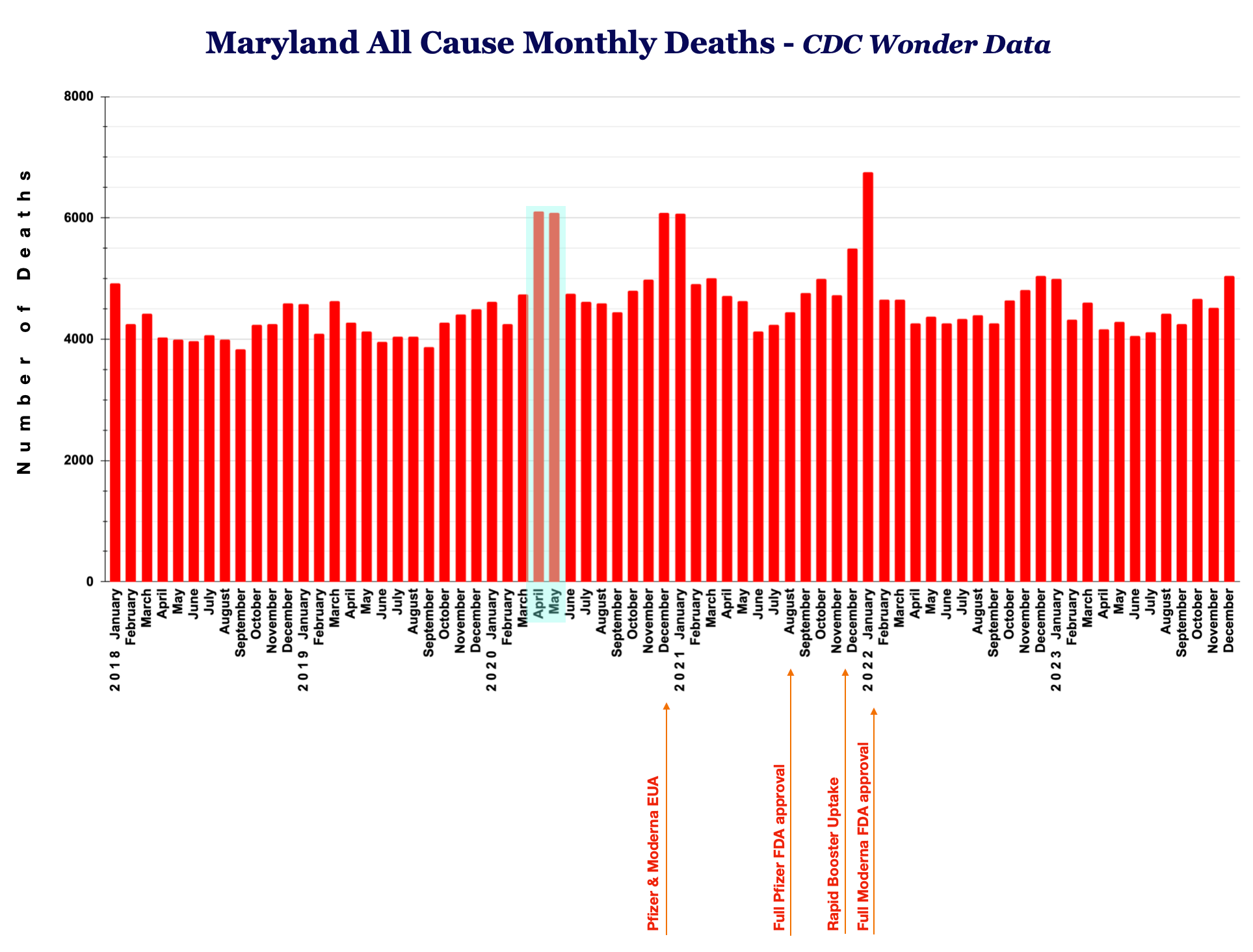
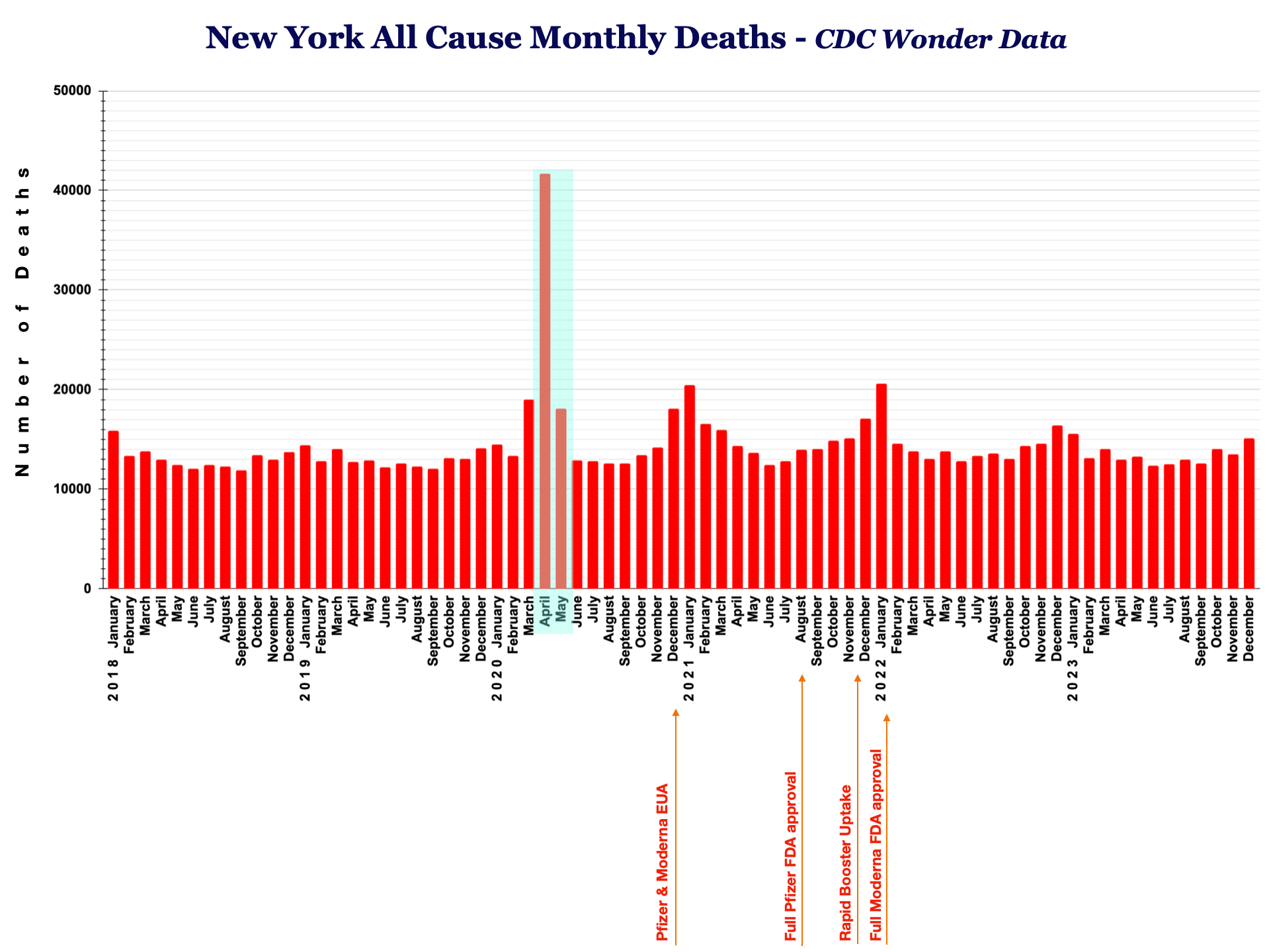
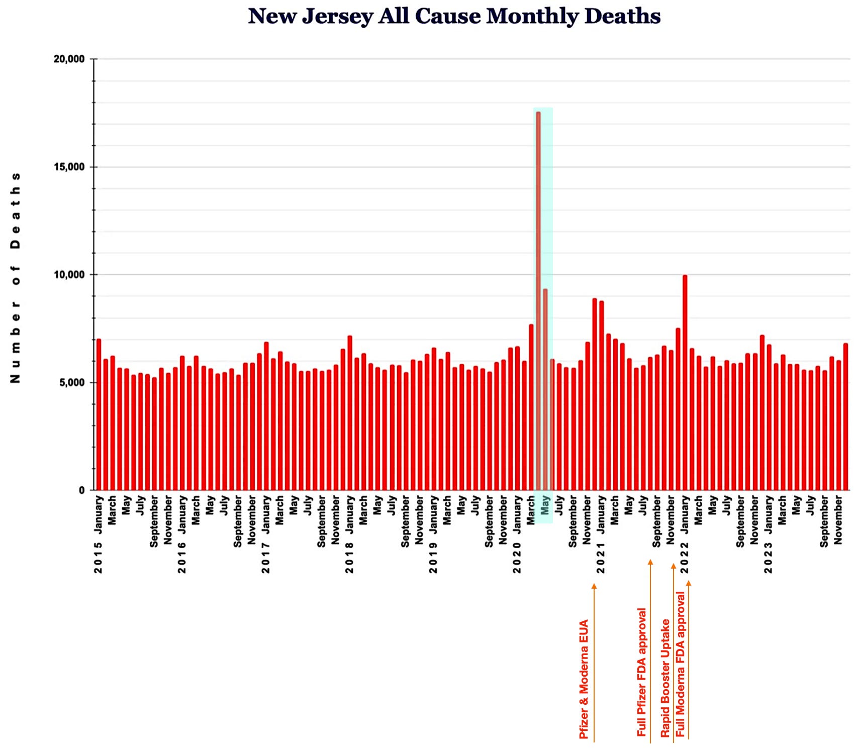
By accident, I noticed another spike showing up … much earlier than the other three elevated bars on the graph. On all three blue state images I made for that last post, there was a consistent bump in the numbers in April/May of 2020. At the time, I mentioned that I was not seeing this same phenomenon in the red state graphs I had previously made.
.
Well now it is time to explore this further.
.
Is it happening on other blue state graphs?
And is it exclusive? By that, I mean it is not showing up on any red state graphs?

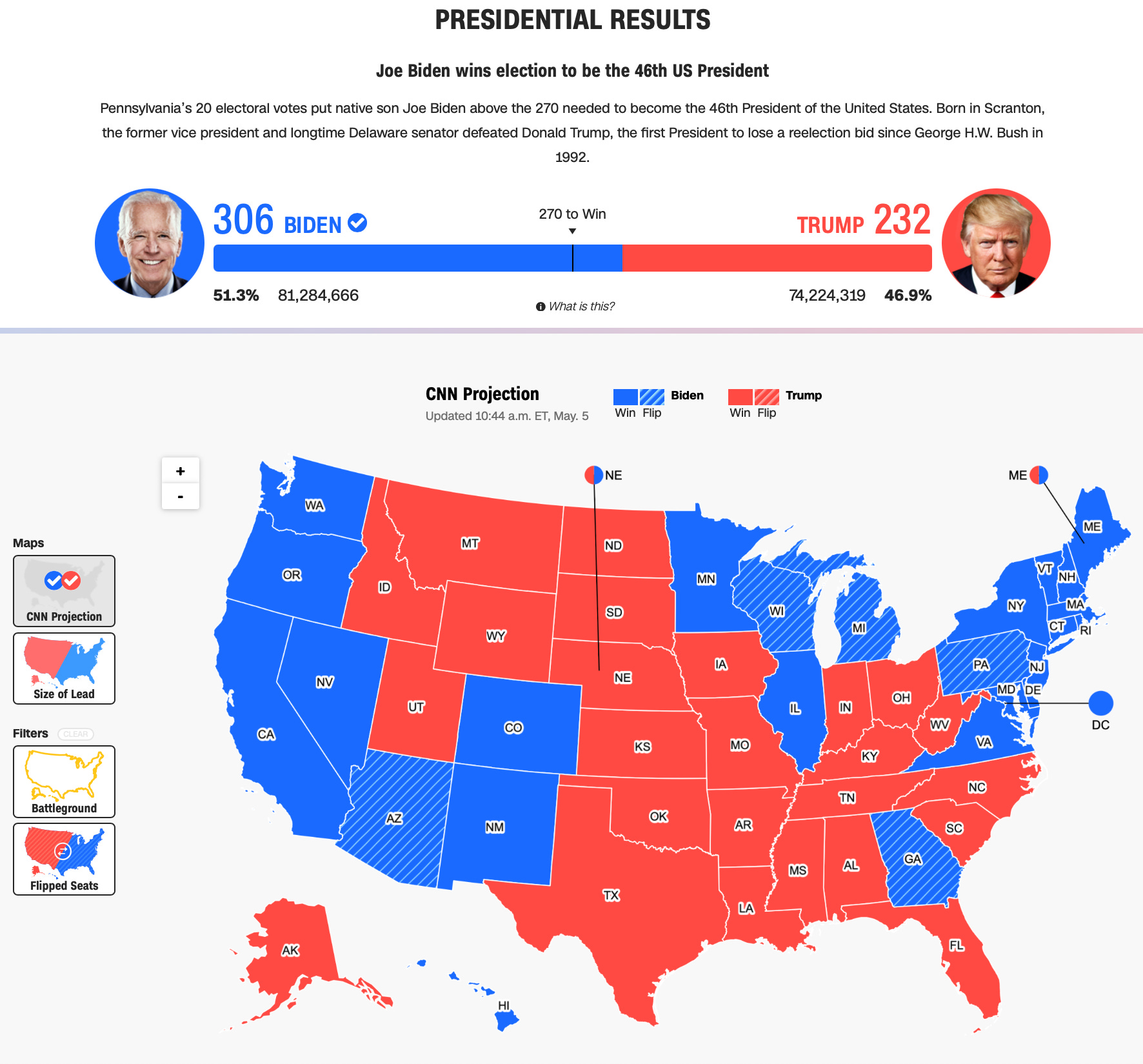
CNN - Presidential Election Results 2020
.
.
.
.
.
.
.
*at this point I will take the opportunity to remind you of two other “blue” state graphs I previously made for the first post in this series.
.
.
.
.
.
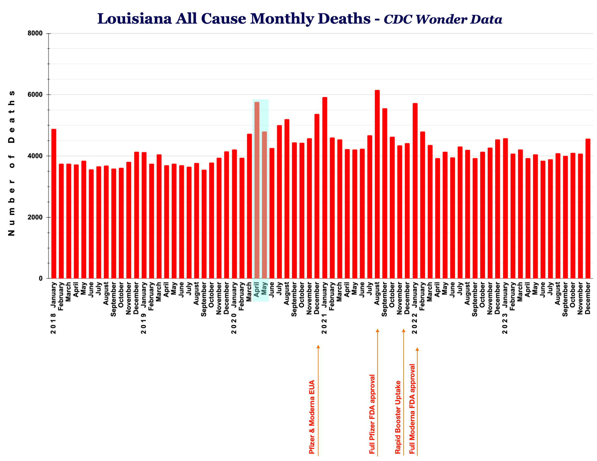
Can I find the same event on any red state graphs?
.
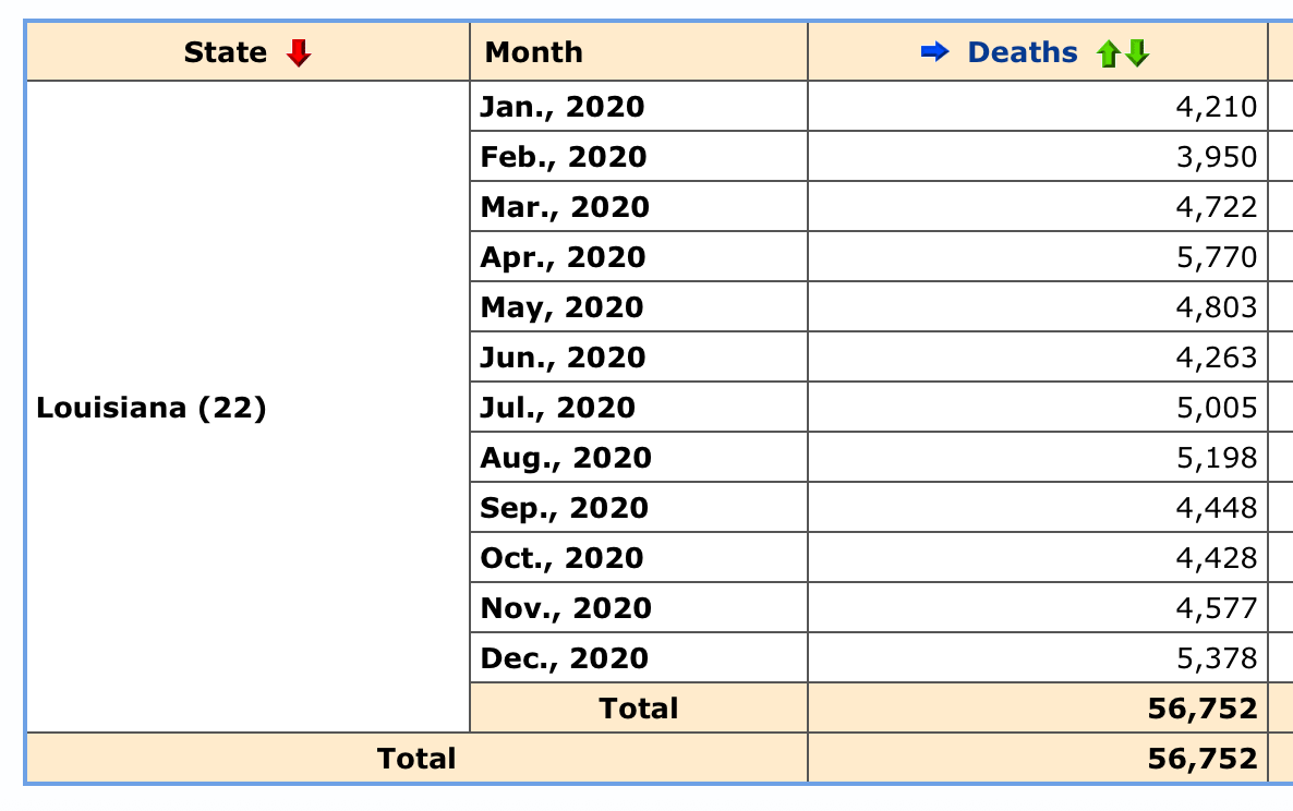
Only one was in the same category … Louisiana.
.
.
Other than that, I could not find another red state graph that had similar significant elevated bars for April/May 2020.
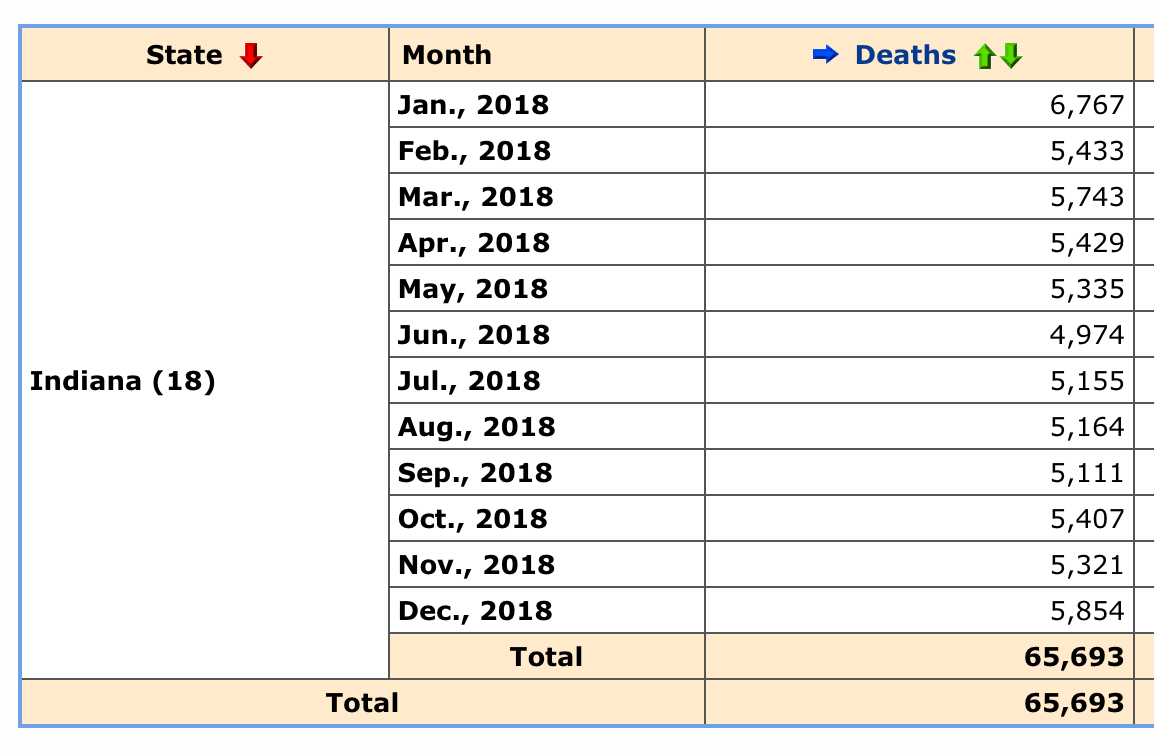
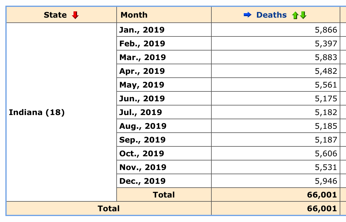
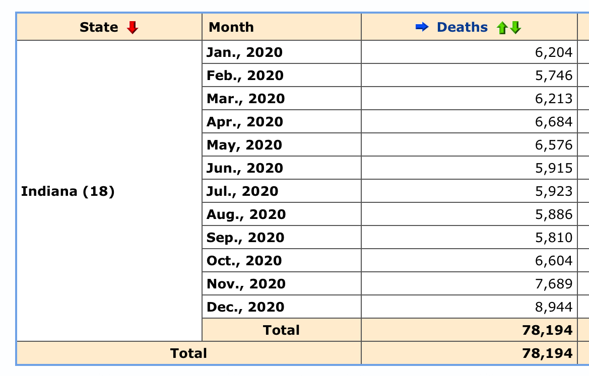
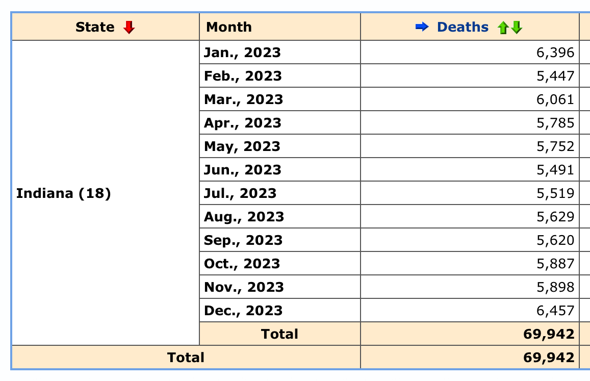
Okay, just so you don’t come back at me later, I will throw in Indiana. But the spike is very small.
.
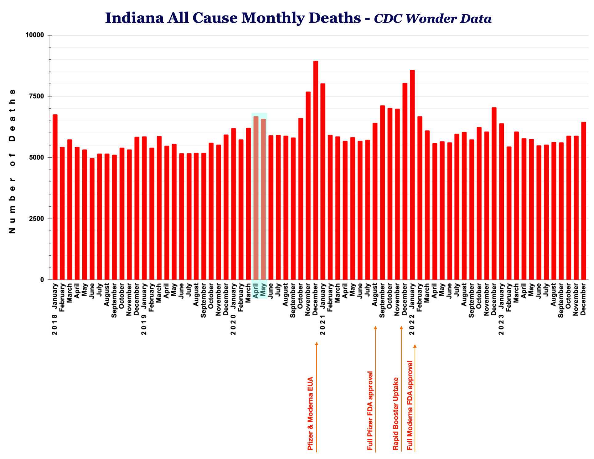
.
But that’s it.
No other red states had anything to show for this extra April/May of 2020 spike. It seems to be an almost exclusive blue state feature.
.
.
*… and I will say that spike number two is pretty much hidden or gone on the majority of these blue state graphs shown in this post … sometimes it seems to morph into the booster spike … if anything.
.
.
.
CDC Wonder: State / Month / All Cause Mortality
*for a tutorial on how to use this database to get these results, see this
.
.
.
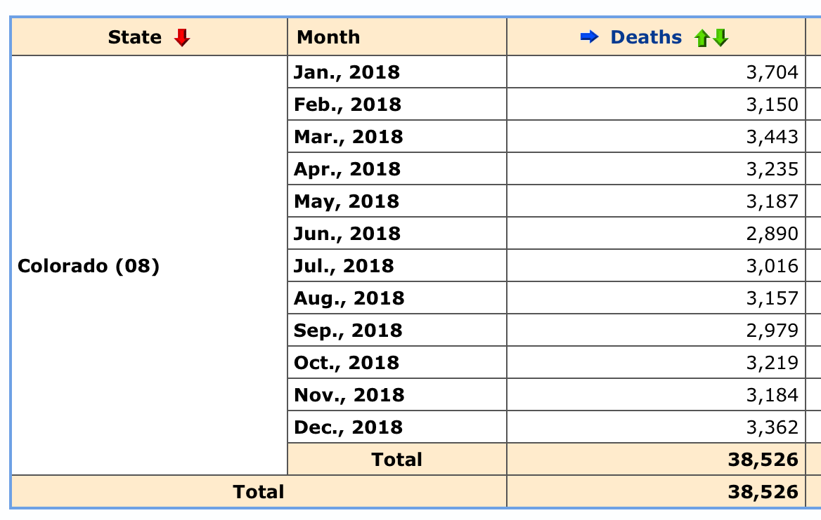
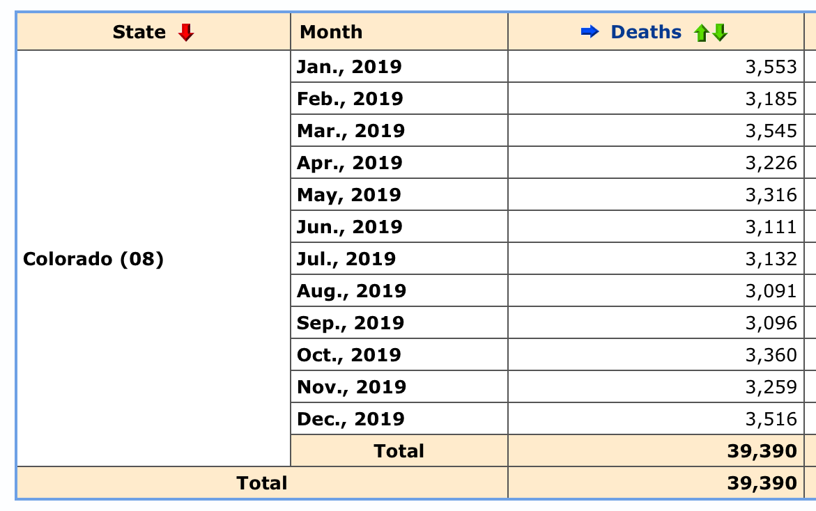
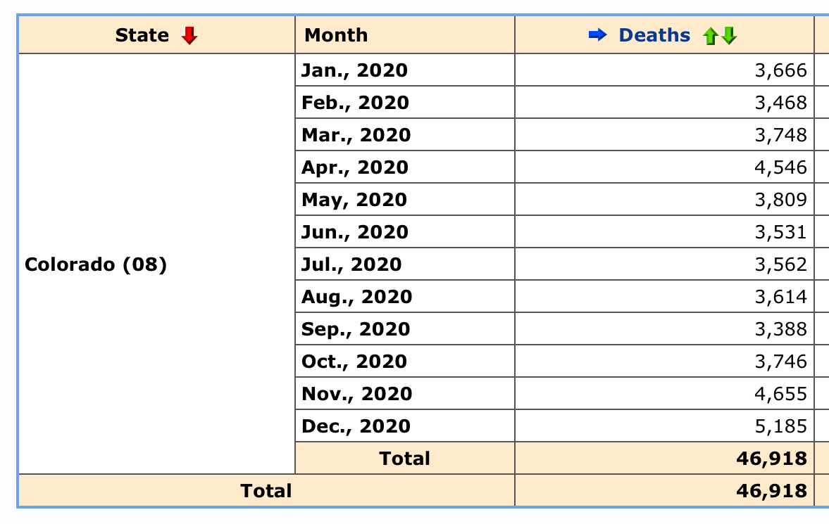
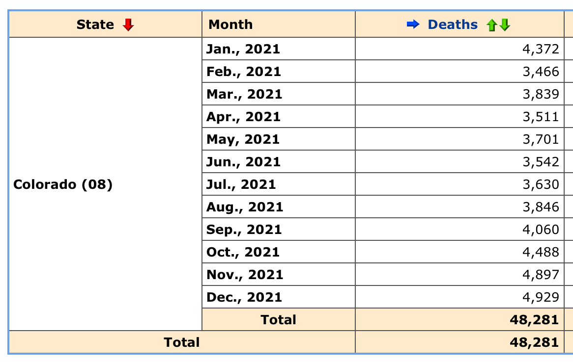
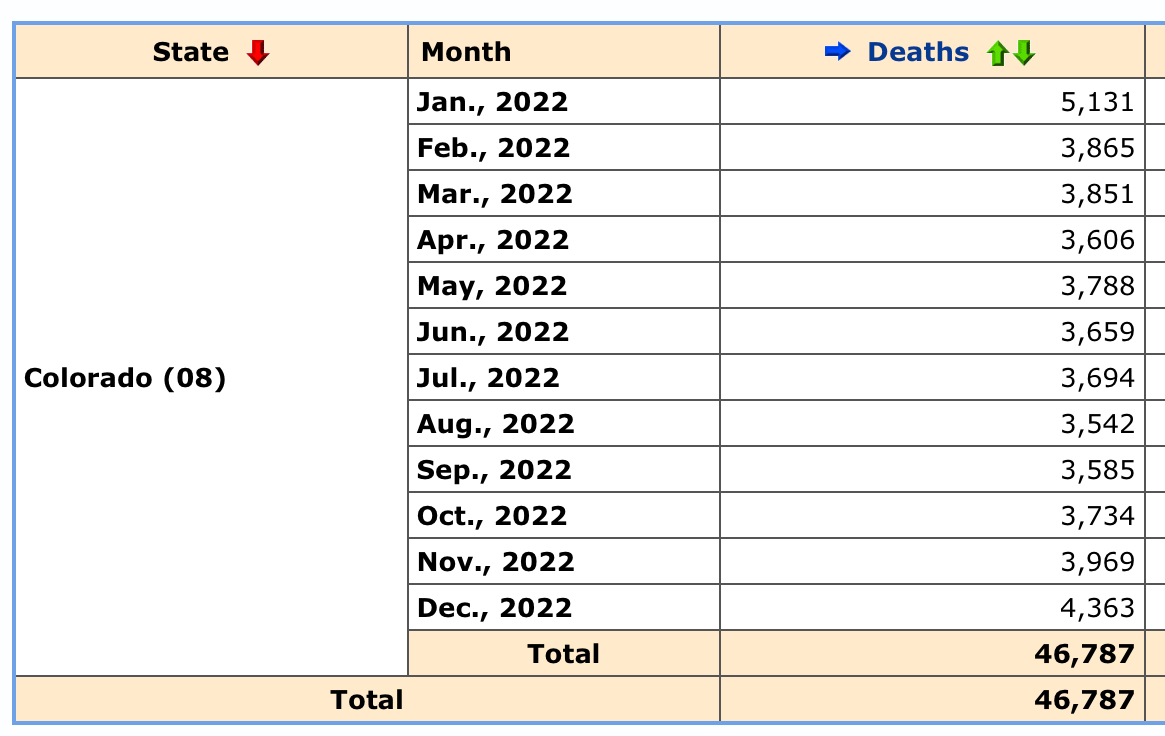
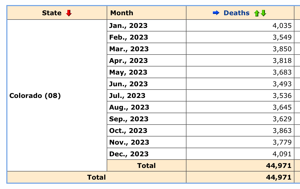
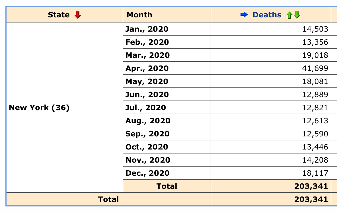
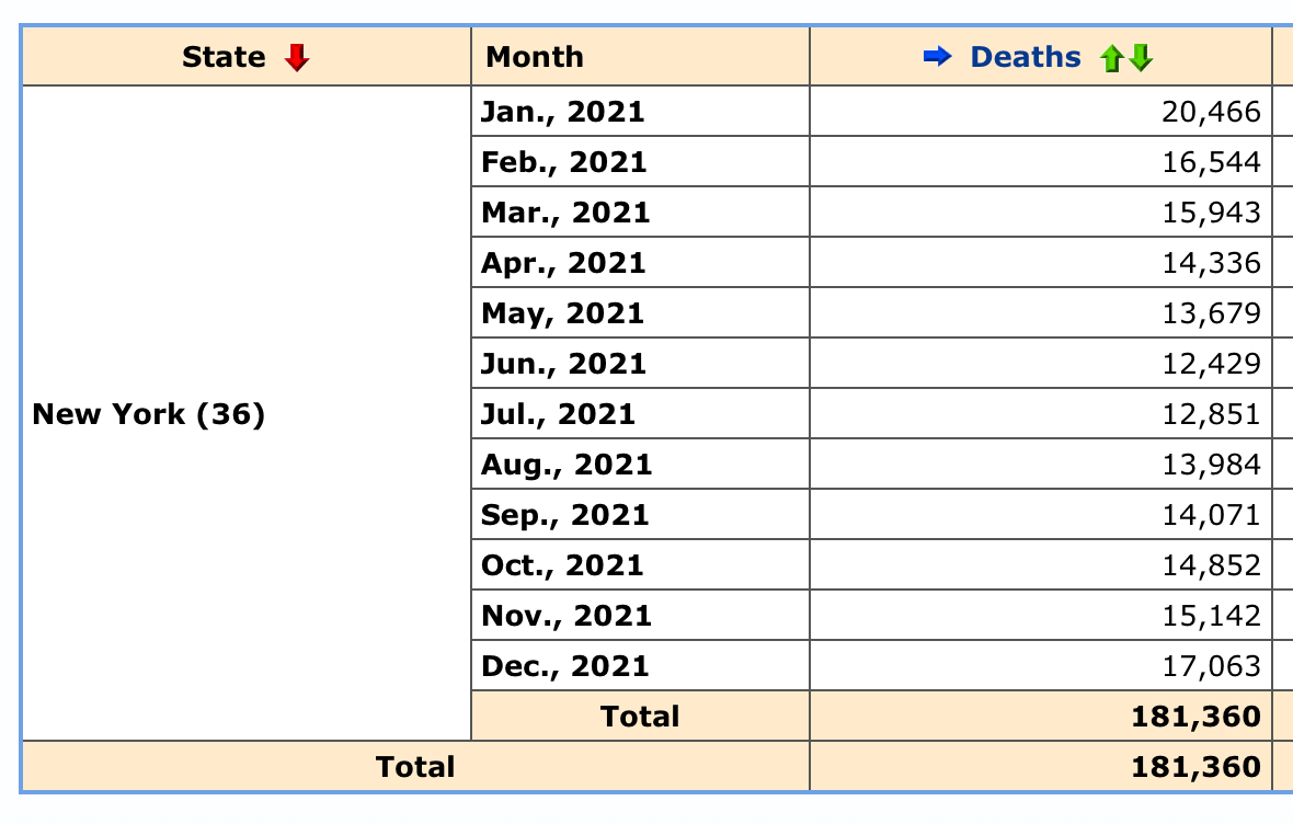
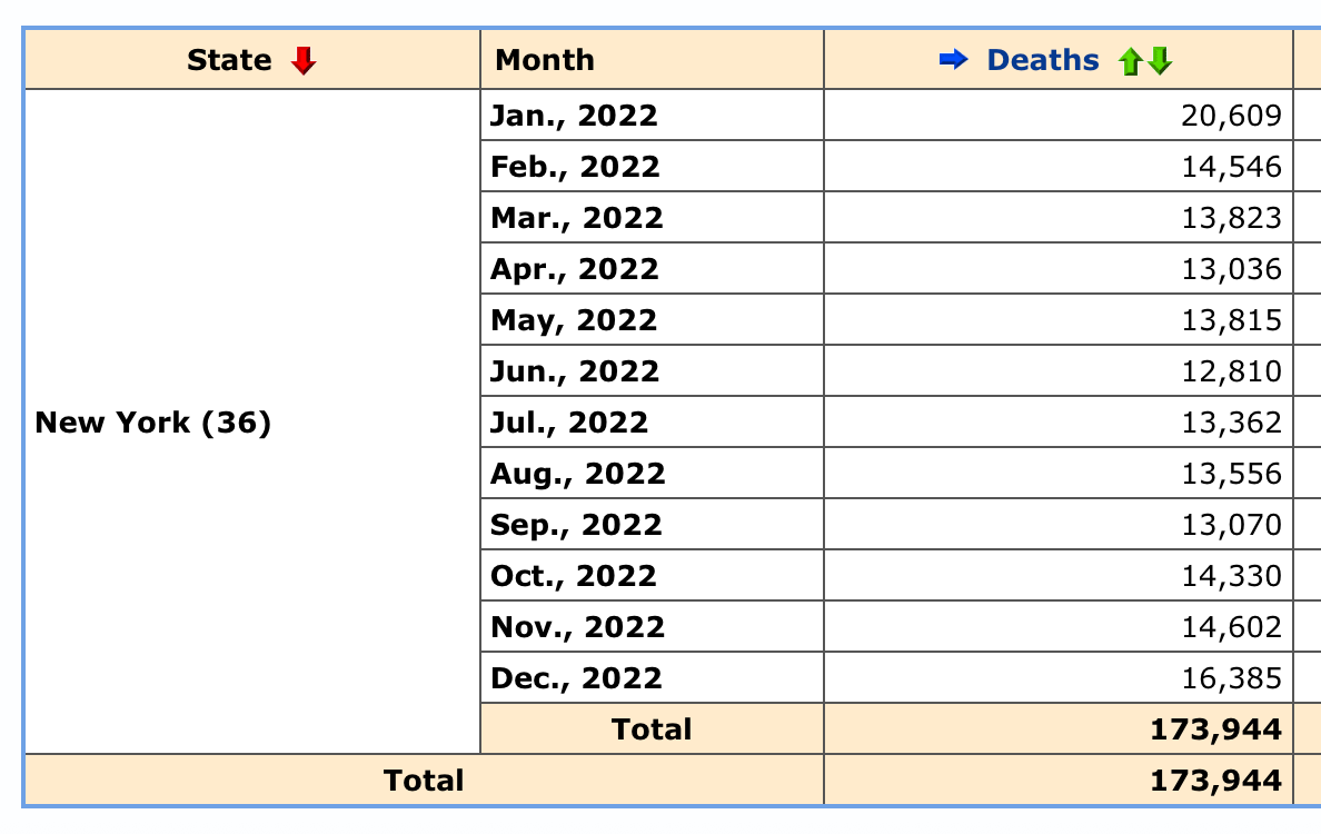
Colorado
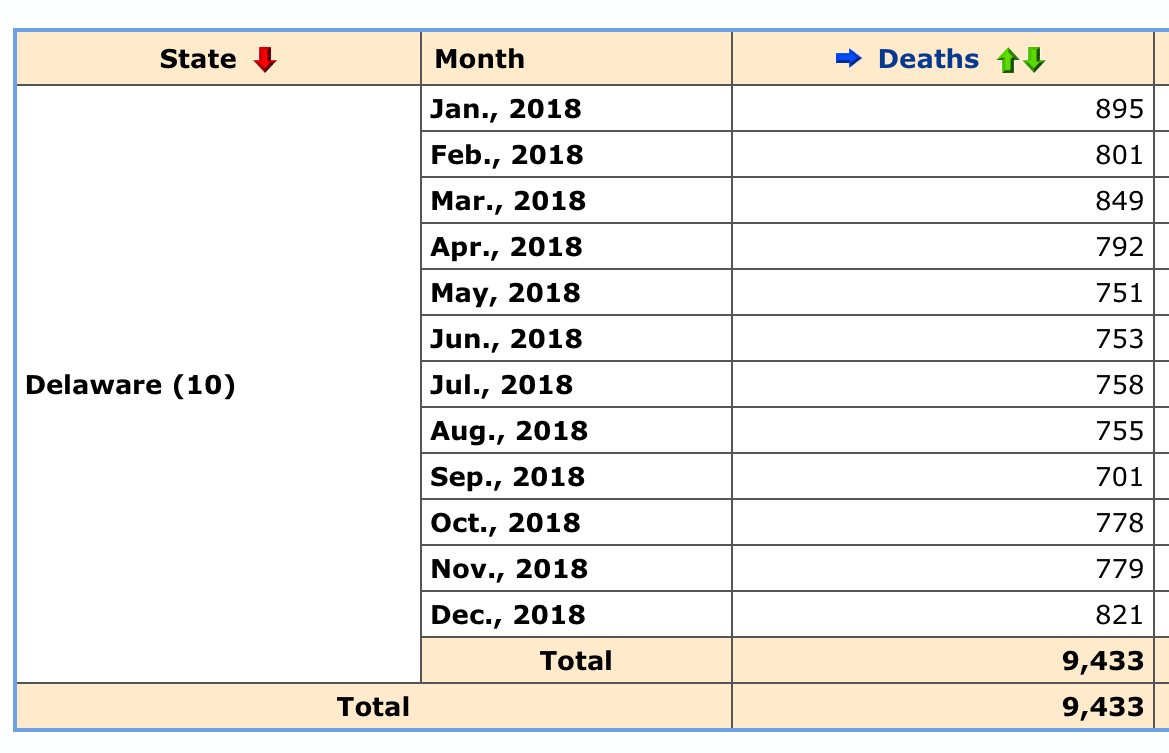
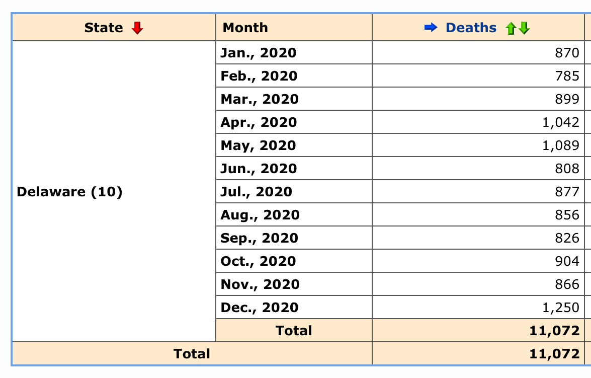
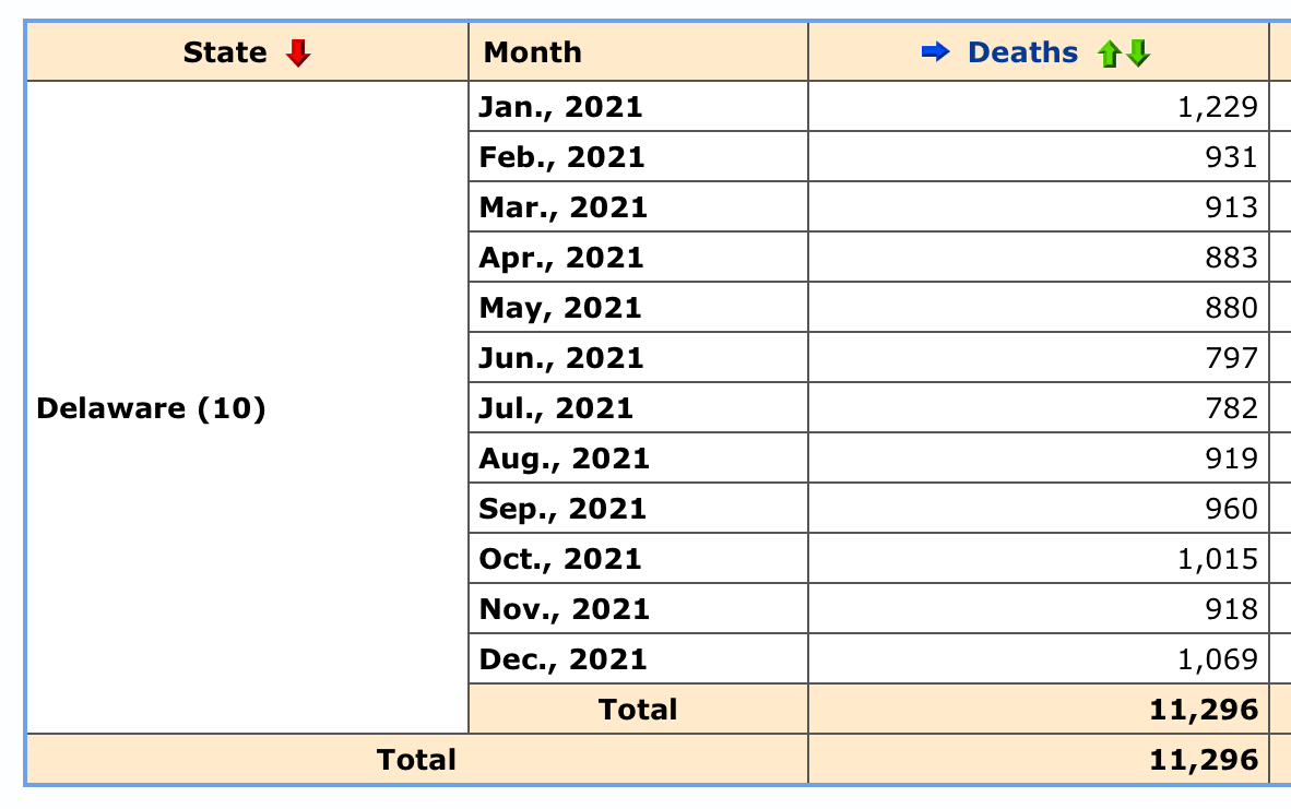
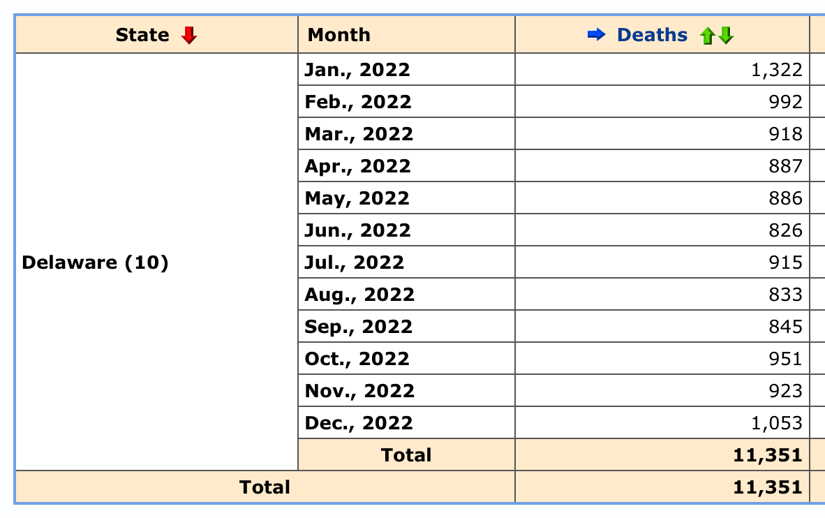
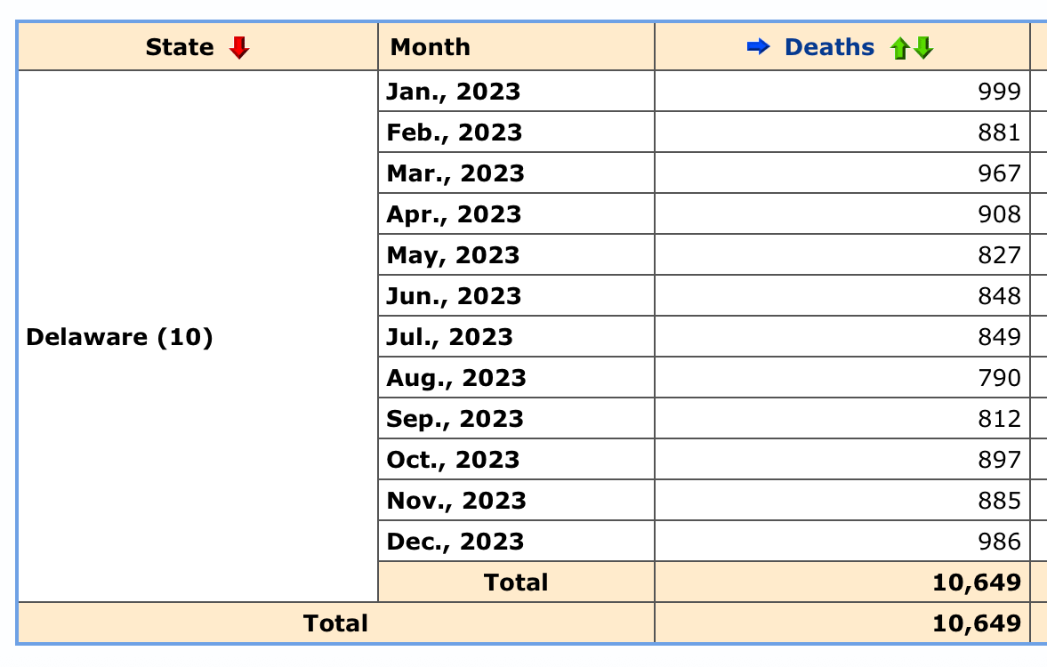
Delaware

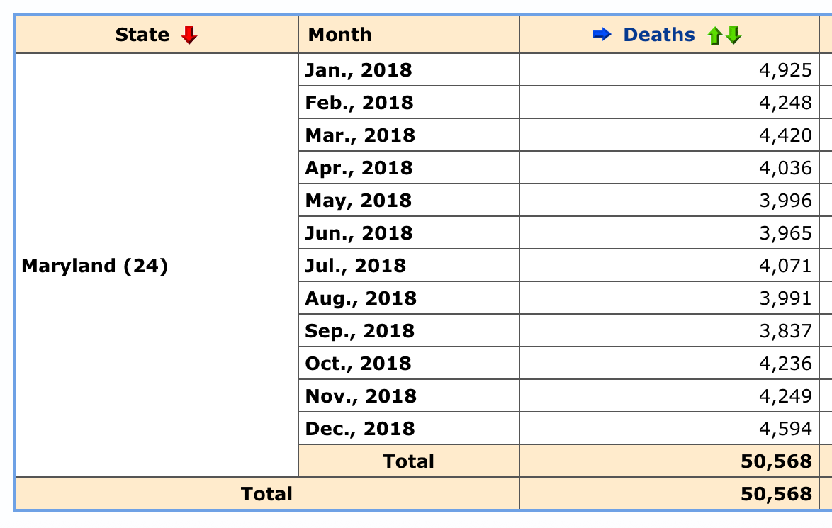
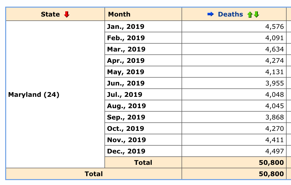
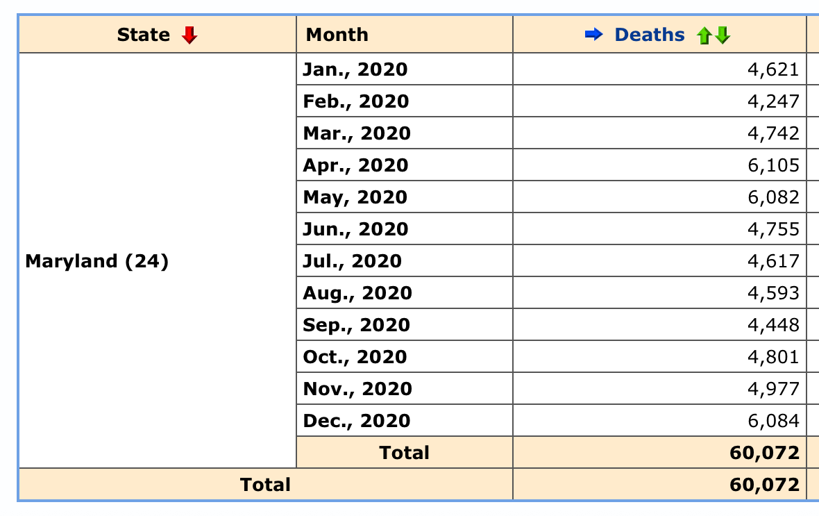
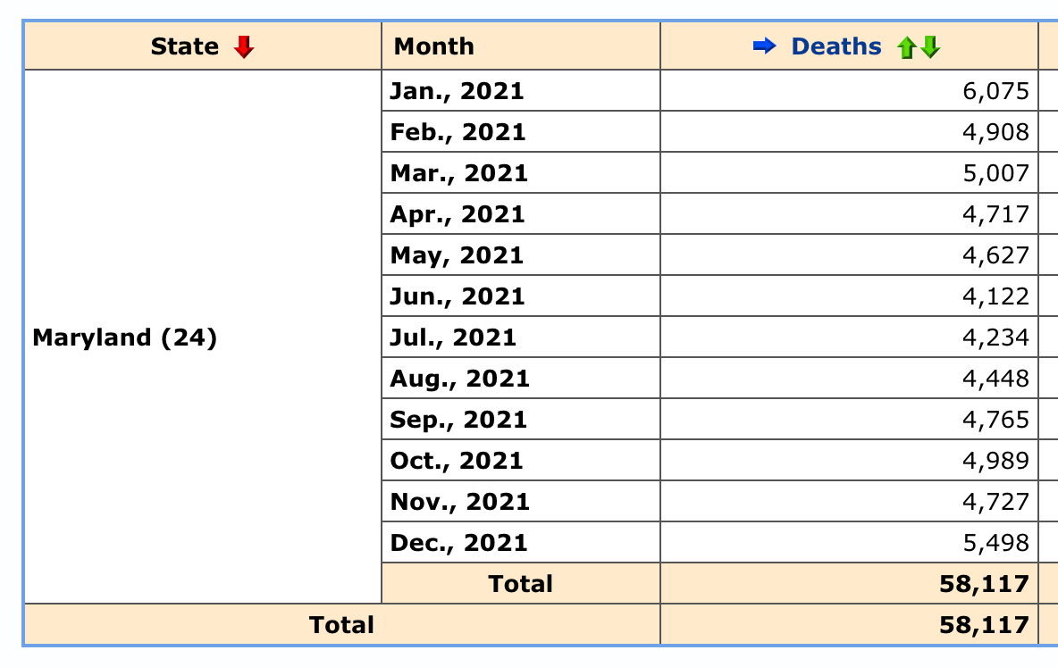
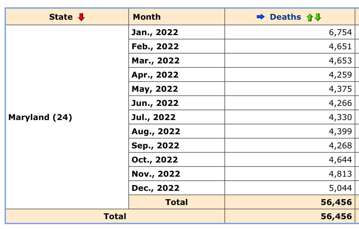
Maryland
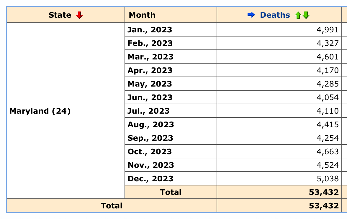
New York


*Michigan and New Jersey had in-state databases that I consulted for those graphs. Links to those sources are found in this post.
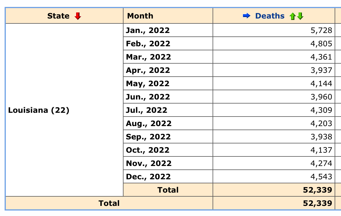
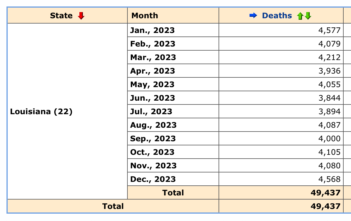
Louisiana


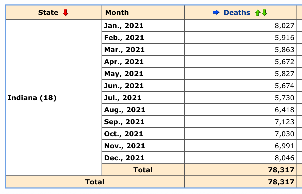
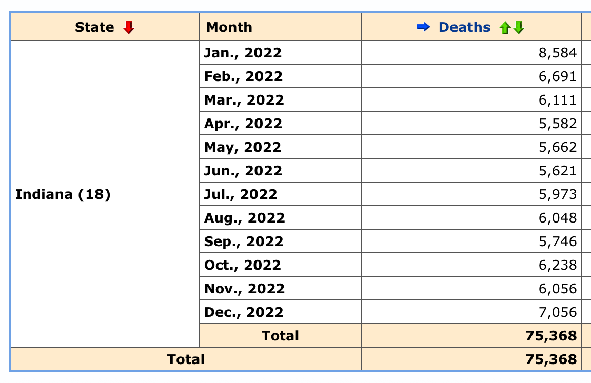
Indiana
.
.
.
*in case you have forgotten …
Pandemic Milestones:
January 20, 2020
-First covid case in the U.S.
December 11, 2020
-Pfizer Emergency Use Authorization
December 18, 2020
-Moderna Emergency Use Authorization
August 23, 2021
-Pfizer full FDA approval
December 2021 / January 2022
-CDC and FDA revise booster recommendations
-Rapid booster uptake
January 31, 2022
-Moderna full FDA approval
April 10, 2023
-Biden declares the end of the pandemic
.
.
.
That’s a lot of sleuthing, resulting in a remarkable blue state pattern. I notice there’s also a small rise (not really a spike) in most of the graphs near the end of 2022/early 2023, but I’m not sure what to make of it, if anything.
The image reminds me of the old sitcom “I Dream of Jeannie” -- is the genie out of the bottle?
csofand— wow.
Funny I was just taking a break from listening to the latest (recorded) VSRF livestream about the white clots and at around 45:00 they start discussing the appearance of white clots in red states vs blue states. https://rumble.com/v6xul8a-episode-191-white-fibrous-clots-on-the-rise.html