
No Two for You
ILLINOIS, MASSACHUSETTS & PENNSYLVANIA - All Cause Mortality Data in the Context of the Covid Timeline

I’m a former public employee that did not want to put an experimental drug into my body just to keep my job. That experience has probably scarred me for life. I am now looking at public institutions, state by state, to see if there is any potential (official) evidence of harm caused by those coerced covid vaccinations.
.
Since it has occurred to me that it is really, really nice to have official monthly data in order to compare events to the timeline of Covid, I am going to keep giving you that from state to state as I find it … a continuation of what I started here.

I was excited to get a comment today from SuperSally888. They left me this message on my post “The Third Spike”:
(emphasis mine)
.
“I have been looking at mortality in selected countries including Australia, France, and in Asia - Macau, Hong Kong, Malaysia, Singapore, Philippines, Taiwan.
What I have seen is that in high socioeconomic countries the big spike in deaths came with booster dosing, unequivocally.
However, in middle/lower socioeconomic countries the spike in deaths came with primary series, before any boosters rolled out. Specifically, the Philippines (biggest spike came concurrent with Janssen rollouts) in August of 2021. Malaysia had a similar very high spike (though I don't have access to their breakdown of doses). Jamaica had an extreme spike soon after rollout even though official data only points to about 25% of their population being injected. It makes me strongly suspect that the batch lots and toxicity levels were different for different countries. Notably for Philippines and Jamaica (I am not sure about Malaysia) vaccines came via Covax / WHO. Could I be conspiratory and suggest that higher strength and toxicity products were sent to countries who were suspected would not be taking multiple boosters: The planners wanted the damage done with the primary series.
My regularly updated summary on the population outcomes for the countries I am following which provides damning images of deaths, births, and vaccine dates: “
.
I have heard of the fantastic research that Super Sally has been doing, but must admit that my own projects leave me not enough time to look at what everyone out there is contributing to the cause. But thank you Super Sally for the information you shared, it has helped me to possibly understand some strange things I have noticed in my graphs.
In my last post “of a feather”, you most likely caught on to why I titled it that way. All four of those states presented are of course what we have come to know as “red states”.
Conservative leaning, republican … voted for Trump … etc.
Would we see a difference in the graphs if we looked at the other side of the coin?

.
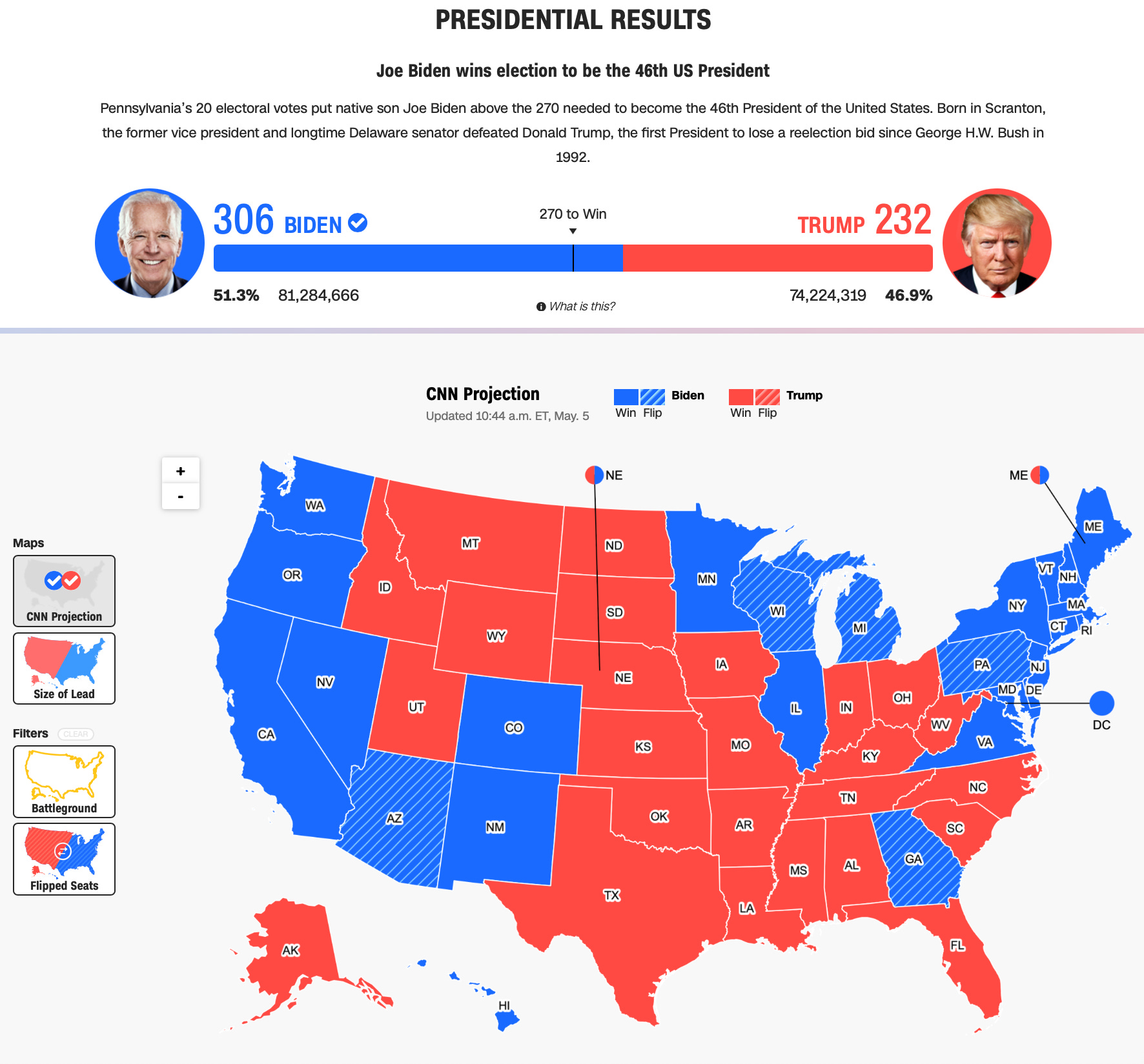
CNN - Presidential Election Results 2020
.
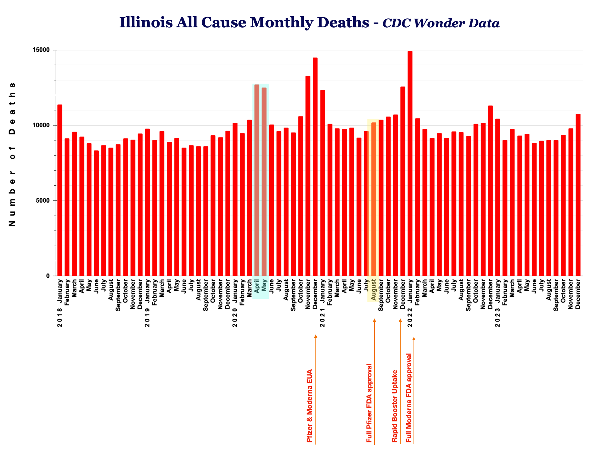
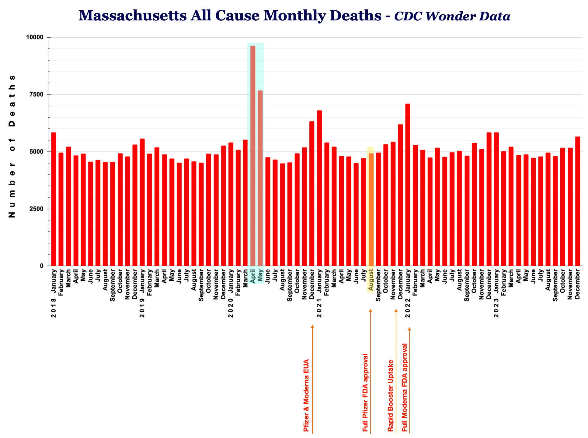
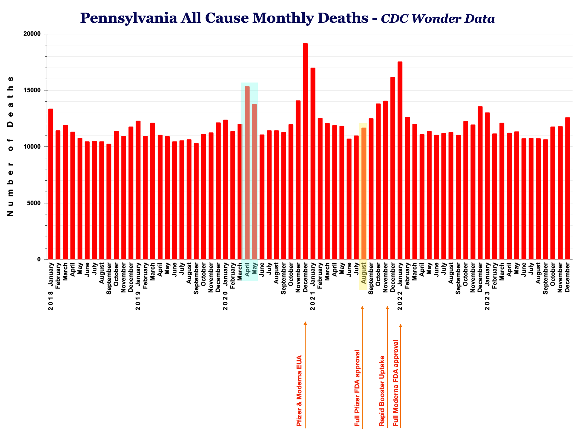
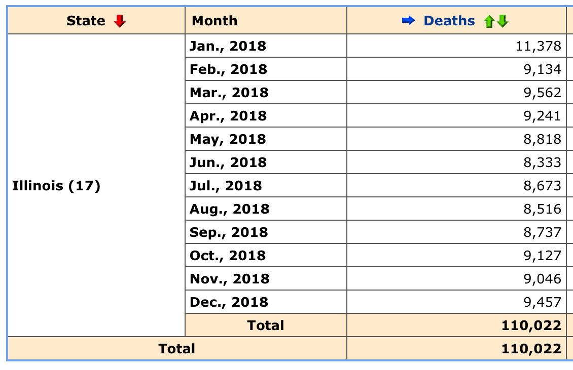
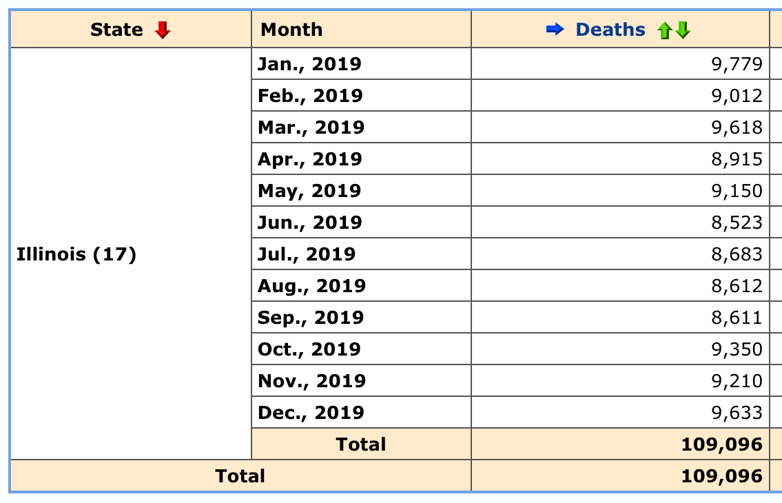
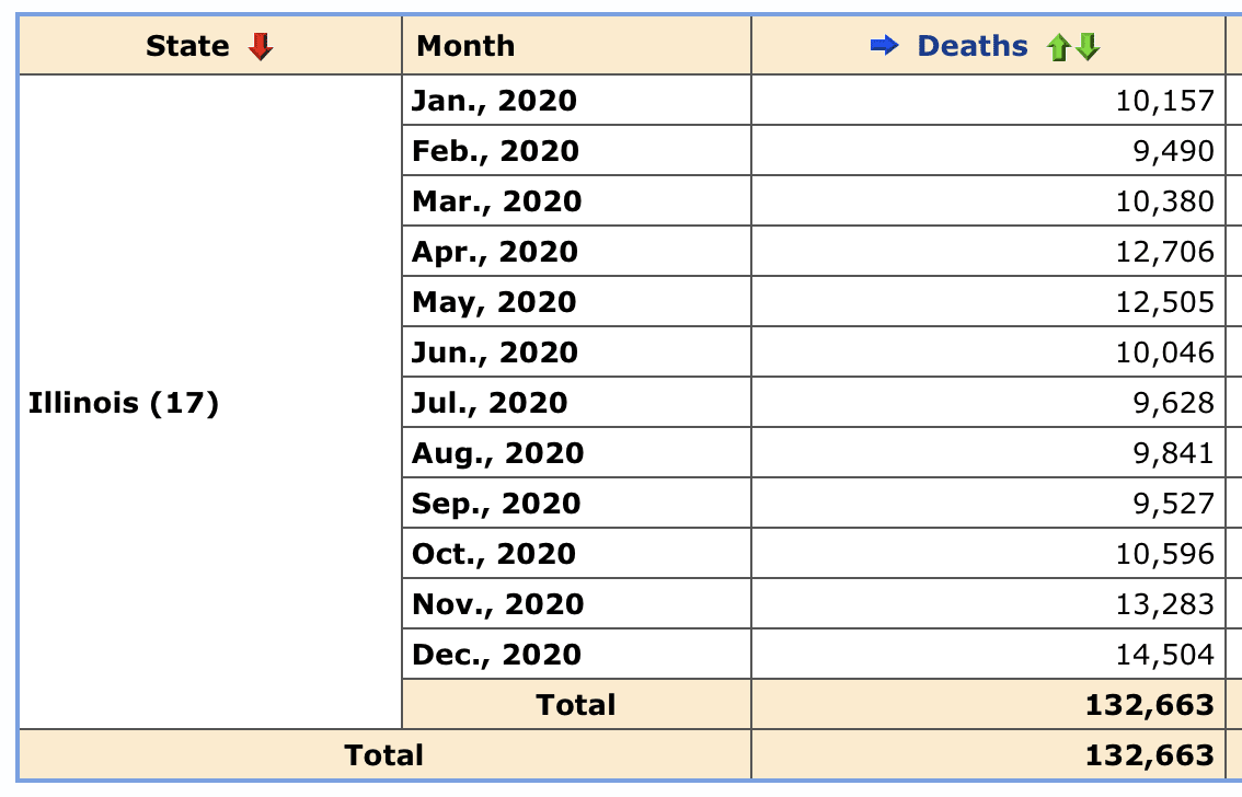
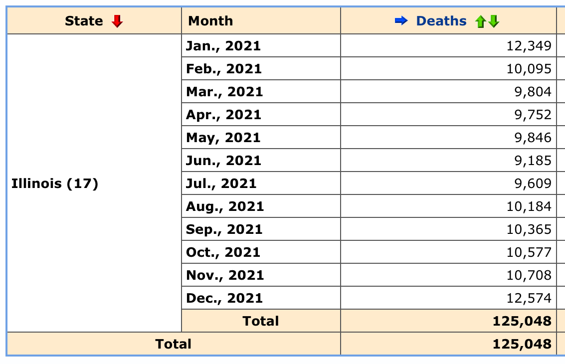
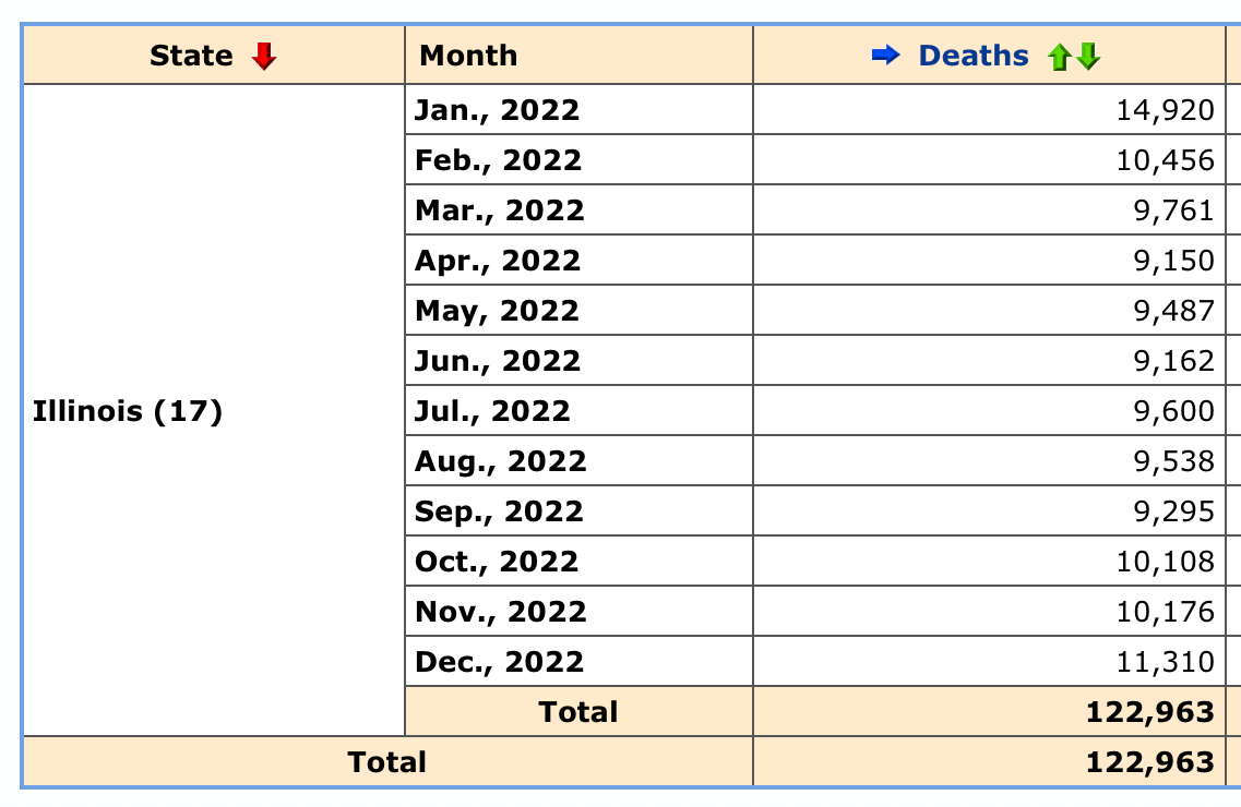
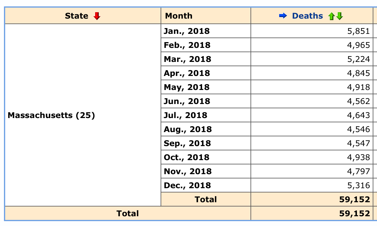
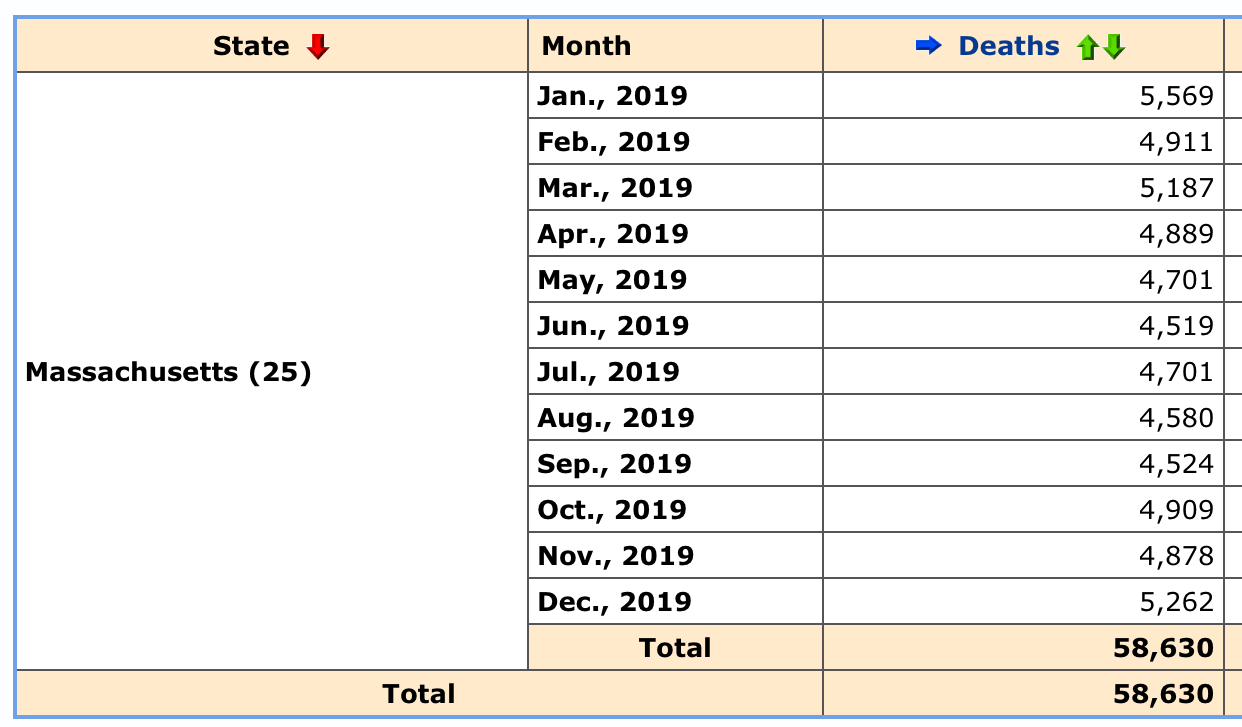
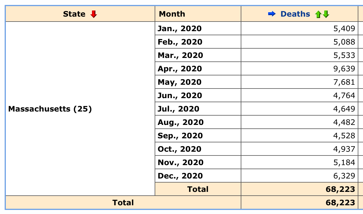
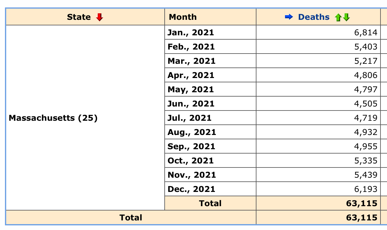
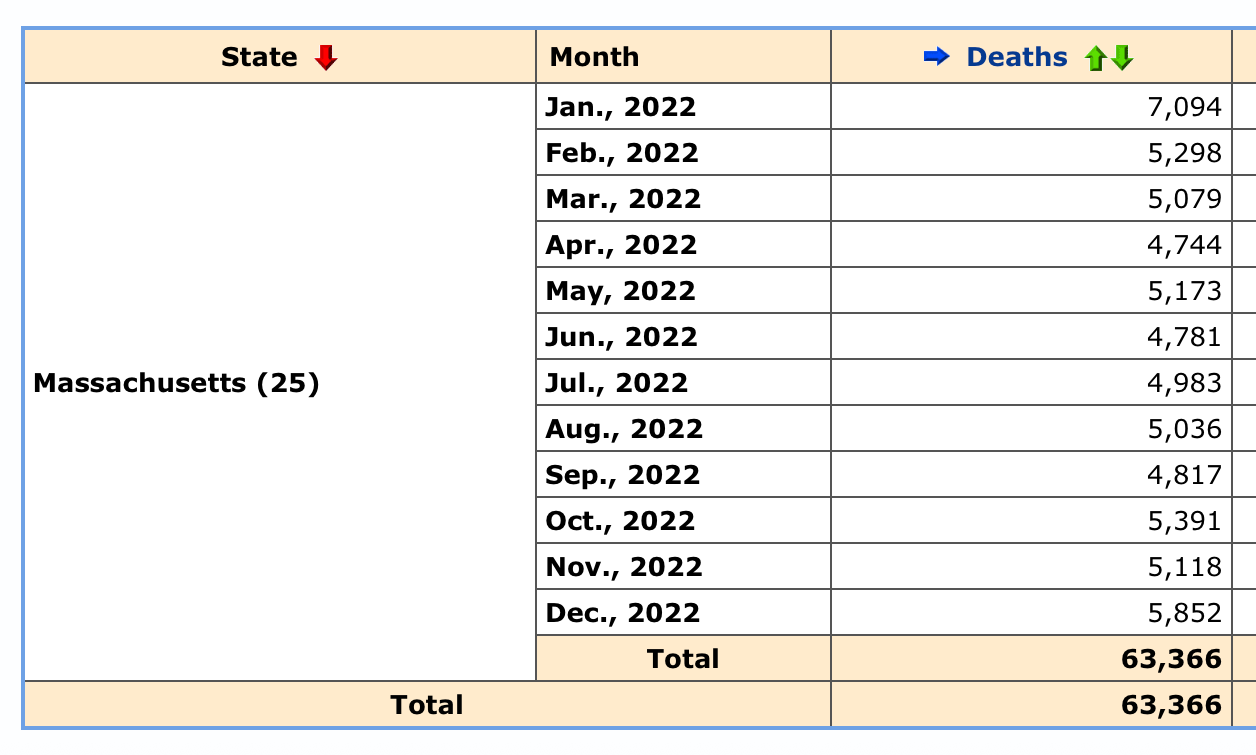
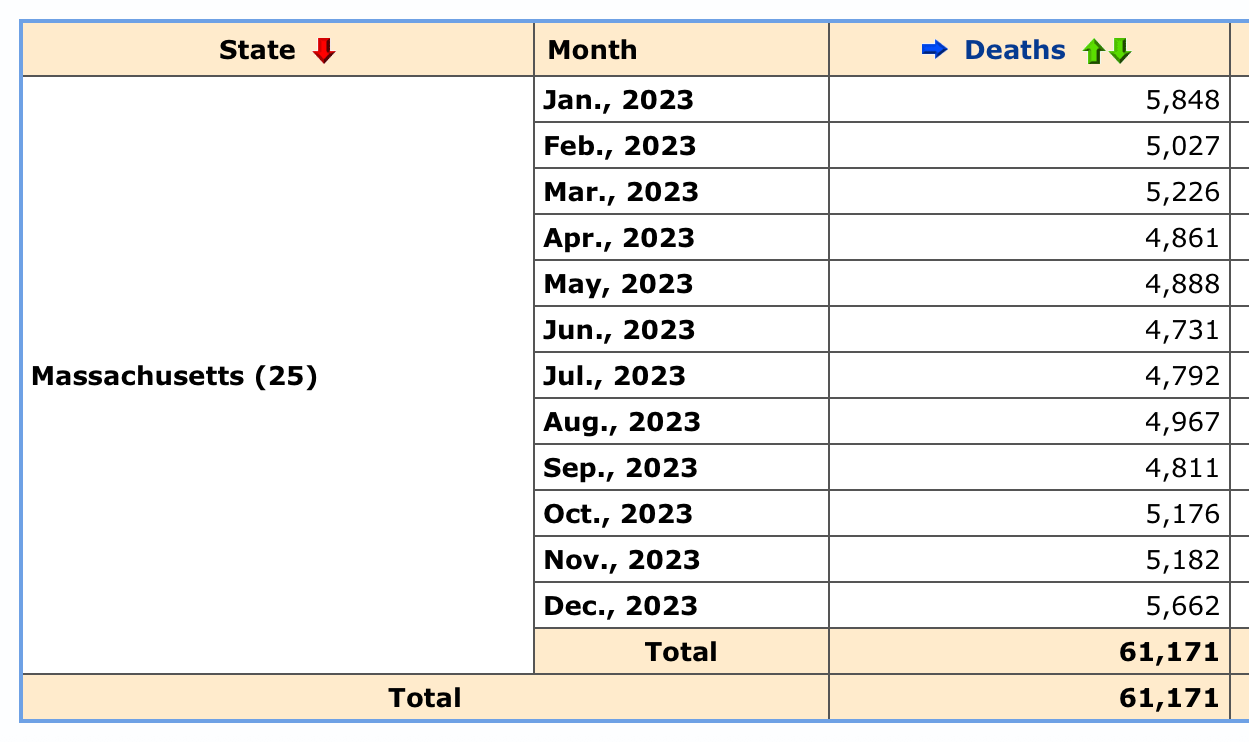
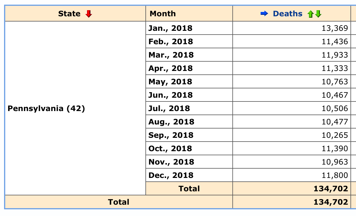
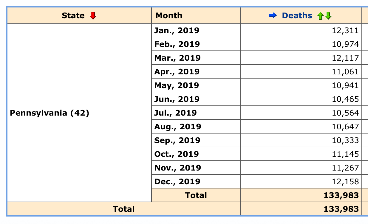
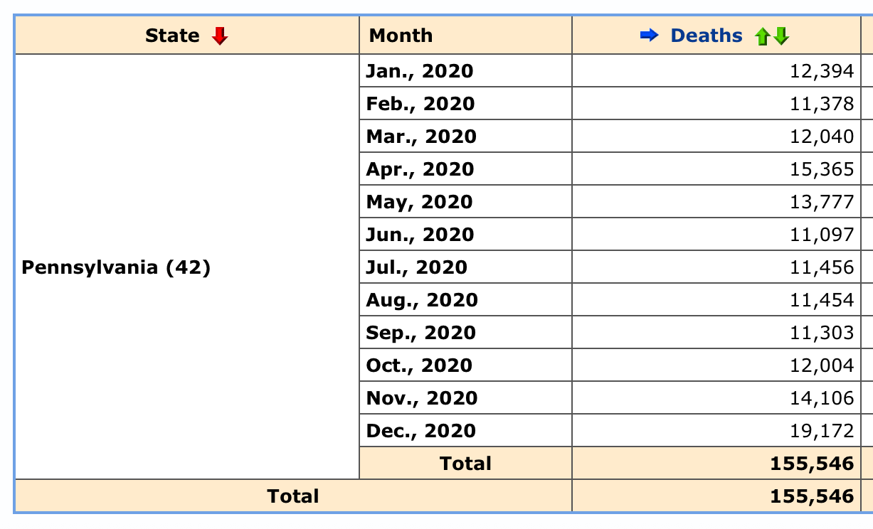
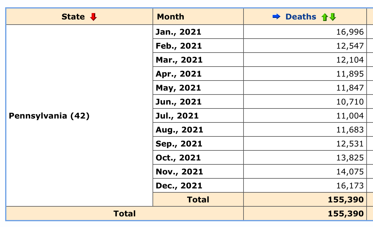
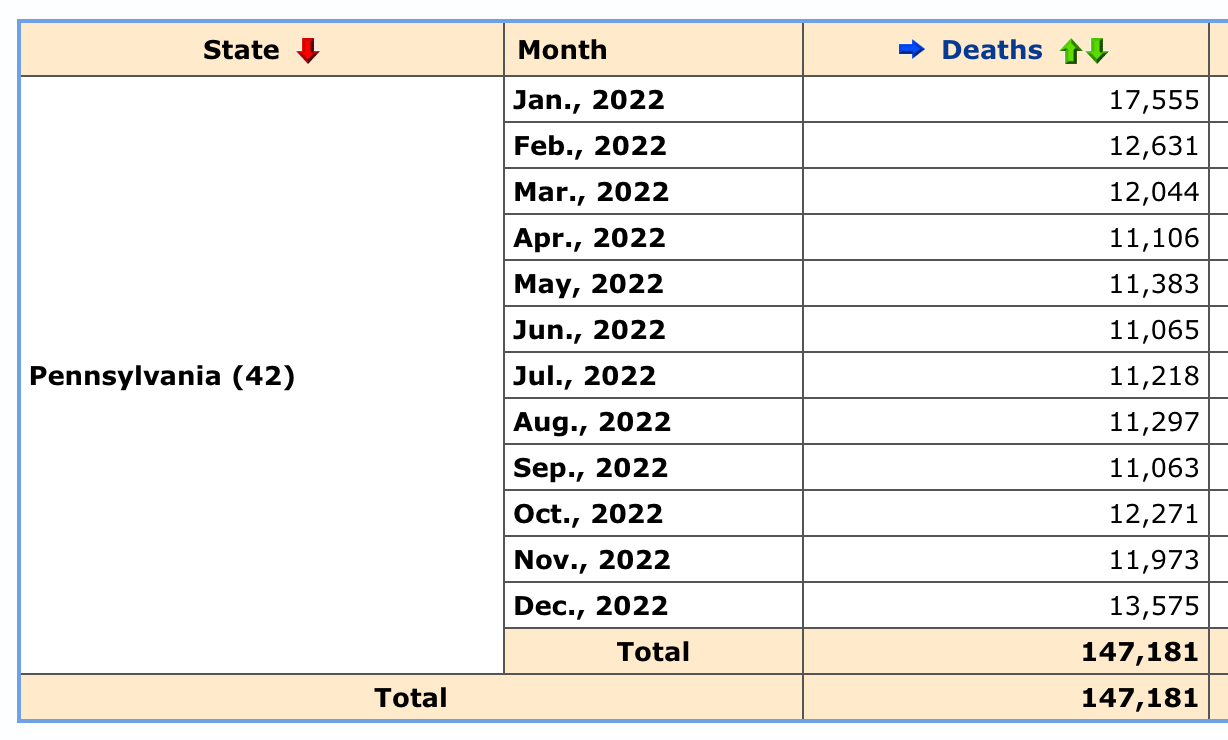
*What I would like you to notice in the following three graphs for the “blue states” of Illinois, Massachusetts & Pennsylvania are two things:
First, as my title of this post suggests, and considering Debbie Lerman’s “three spike pattern”, these three states really have no clear spike number two. That spike is the one we usually associate with the August of 2021 (highlighted in yellow) rollout of the fully approved Pfizer vaccine.
Secondly, please look at the months of April and May in 2020 on each graph (I have highlighted those in light blue). All three “blue states” here have a significant spike in mortality in that timeframe which curiously does not show up in the “red state” graphs shown in my last post.
Why would these things occur? Does it have something to do with the points that Super Sally brought up? Are we seeing the evidence of something different in the composition of the vaccines delivered to various regions?
As for the April/May 2020 spike, that would have to be something other than the vaccines as the cause.
Covid itself?
Hospital protocols?
I do not know.
.
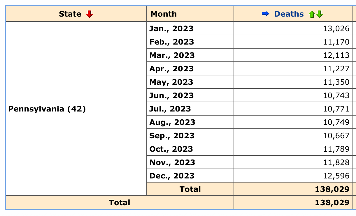
But here are the graphs … data courtesy the CDC.
.
.
.
.
.
.
.
.
CDC Wonder: State / Month / All Cause Mortality
*for a tutorial on how to use this database to get these results, see this
.
.
.
Illinois

Massachusetts
Pennsylvania
.
.
.
*in case you have forgotten …
Pandemic Milestones:
January 20, 2020
-First covid case in the U.S.
December 11, 2020
-Pfizer Emergency Use Authorization
December 18, 2020
-Moderna Emergency Use Authorization
August 23, 2021
-Pfizer full FDA approval
December 2021 / January 2022
-CDC and FDA revise booster recommendations
-Rapid booster uptake
January 31, 2022
-Moderna full FDA approval
April 10, 2023
-Biden declares the end of the pandemic
.
.
.
I didn’t know about SuperSally888’s work, thank you.
You probably know about the “How bad is my batch” site, which tracks vaccine batches and lot numbers according to geographical distribution. Here’s a page that breaks down mortality and morbidity by state via batches and includes an analysis of red/blue differences:
“Observations
There is considerable variation in the number dying per 100,000 vaccinated. Some states have 16 x the death rate compared to others.
“Red states tend to cluster towards the top of the chart, whilst blue states cluster towards the bottom.
“Red states occupy 6 of the 7 highest ranking positions for deaths per 100,000 vaccinated”
https://howbadismybatch.com/states.html
See also https://howbad.info
Both sites have many compelling analyses of this data.
Love the picture of “the elephant in the room.”
Brazilian Ministry of Health has record-level data for all-cause mortality and covid-19 vax:
https://opendatasus.saude.gov.br/dataset/sim
https://opendatasus.saude.gov.br/dataset/covid-19-vacinacao
It is fairly evident that the model adopted was EXCESS MORTALITY=COVID MORTALITY=EXCESS MORTALITY. Nobody admits is but the evidence is undeniable.
These is also some evidence of post vaccine increase in mortality, though not screaming evidence.