
The Pandemic Window
*


.
.
.
Things begin.
Things end.
Things go up.
Things go down.
.
.
.
.
.
.
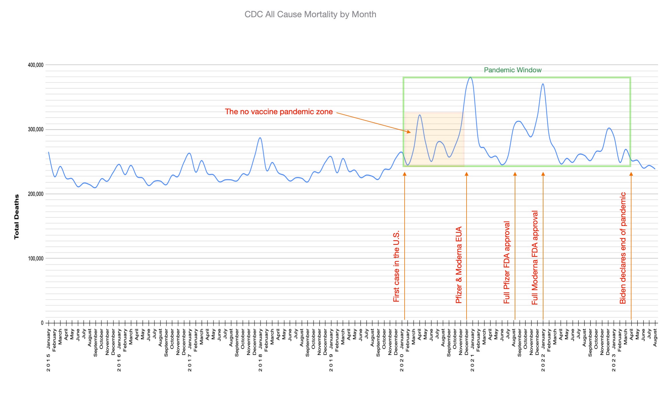
I propose a frame. This shall be the window to help us see the event we know as the coronavirus pandemic. I shall call it The Pandemic Window.
The left side of the pandemic window frame shall begin on January 20, 2020. This is when the CDC confirmed the first case in the U.S.
The right side of the frame will end on April 10, 2023. This is the date that President Biden declared the end of the pandemic.
The bottom of the frame will be the lowest dip of death entries in the time period.
The top of the frame will be the largest peak of monthly death entries in the period.
To assist in this task we have created a graph of all cause death entries from the CDC database (there are two datasets, 2014 through 2019 & 2020 through 2023) . This linear progression, from month to month, extends back to the years before the pandemic and ends in September of 2023, when the CDC stopped their monthly tally in the data we are using.
.
.
.
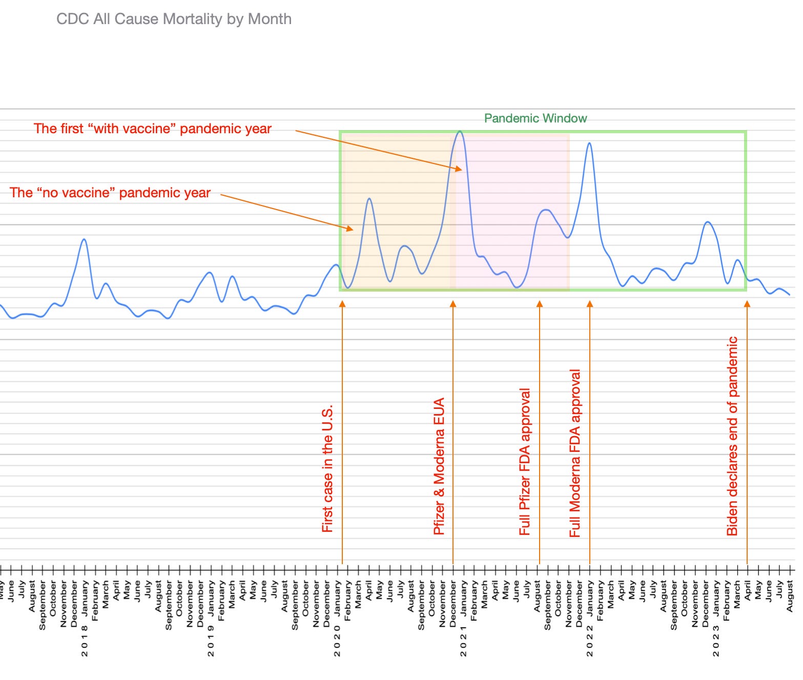
In this window, would it be fair to differentiate between the pandemic with vaccine, and the pandemic without the vaccine? I think most reasonable people would say yes to that.
Would it then be wise to compare what happened in the two distinctive parts of the window? For example, we could calculate the average monthly deaths in the no vaccine part and compare that to the average monthly deaths in the with vaccine part.
Let’s do that.
.
The no vaccine pandemic monthly average is 282,506 deaths.
The with vaccine pandemic monthly average is 279,305 deaths.
Almost statistically identical, wouldn’t you say?
.
Now that was using the entire Pandemic Window as our testing ground. But as you can see, there is much more “with vaccine” real estate in there. Would it be fair to compare similar sized panes of the window?
Since the “no vaccine” pane is essentially one year in time (January through December of 2020), why don’t we look at how that compares with the next pane in time (January through December of 2021)?
.
.
.
The total number of deaths in 2020 is 3,390,079.
The total number of deaths in 2021 is 3,471,742.
81,663 more people died in the first “with vaccine” pane than in the “no vaccine” pane. To be fair, this might even be considered statistically the same when you are in the millions. But I am no statistician. All I know is that it was a little more.
But the window has one more same sized pane we can fit in. Let’s look at January through December of 2022.
.
.
.
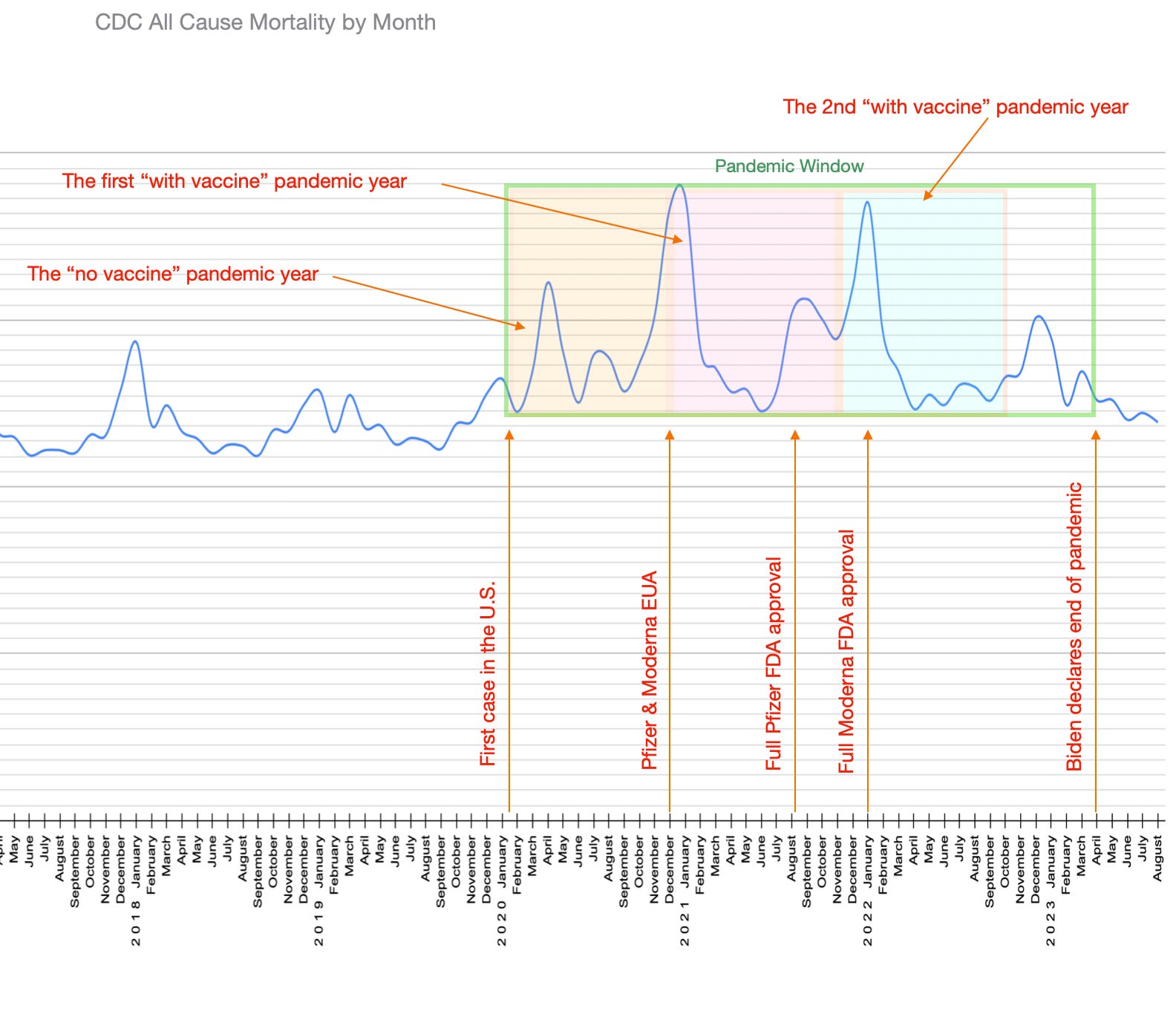
The total number of deaths in 2022 is 3,289,236.
100,843 less people died in the second “with vaccine” pane than in the “no vaccine” pane. Can we reasonably say here that statistically these two panes are the same too? Not being a proper number expert, I can’t definitively profess an answer to that. But less people dying is always good.
.
.
.
Well that is the official story straight from the CDC.
Governments almost always tell us certain types of stories … usually ones that make them look good, that they are the hero and our savior.
.
.
.
But what if our window is not in a stationary house, looking out on the same landscape day after day?
.
Perhaps we are on a moving train examining evolving ground?
.
.
.
.
.
.
Let’s go for a trip, shall we?
.
.
.
See you soon.
.
.
.
External Links:
CDC timeline of the pandemic
(Pfizer & Moderna EUA dates, Pfizer full FDA approval date & Moderna full FDA approval date)
CDC all cause mortality monthly datasets
.
The metaphor of the window frame should be elegant enough to make others see the information clearly: first the death rate goes up, then the vaccine — which is supposed to make the deaths go down — doesn’t stop the deaths from increasing.
Yet something prevents most people from seeing this simplest of illustrations. The observer’s reflection becomes part of the scene they’re looking at, but the onlooker is unaware of the distortion and therefore they assume their vision is accurate.
I haven’t been able to show many (or any, really) people how their assumptions about the pandemic occlude their understanding, how they get in their own way. They often take umbrage at my efforts, as if I’m criticizing them, and some suggest that I’m the one who’s misguided.
My worry is that others won’t question themselves unless some threat — the accelerating death rate becoming undeniably visible — forces them out of complacency. I hope that it’s not too late by that point for better understanding to inform protective action but I’m unsure this hope is realistic.
Interesting exercise but if we just use the overall mortality statistics we might get the impression that the vaccine simply made no difference whereas I think how the mortality figures are similar is that intervention measures during the first year increased mortality - aggressive drug trials, over-prescription of opioids, movement of elderly from hospital to care homes, isolation, ventilators, etc while the vaccine increased mortality in the second year.